Viva Front Door
Viva Front Door
UI/ UX, UX research, Design research, Design workshops
Role:
Lead designer
Feature crew: 2 Designers, 2 PMs, UX research team
The Covid-19 pandemic accelerated changes towards
“the future of work." Employees want greater meaning from work, increased flexibility, and support across their employee experience. Yet, today’s technology frequently does not lend itself to supporting these needs. Internal tools are too often fragmented, difficult to find, and frustrating to use.
The Covid-19 pandemic accelerated changes towards “the future of work." Employees want greater meaning from work, increased flexibility, and support across their employee experience. Yet, today’s technology frequently does not lend itself to supporting these needs. Internal tools are too often fragmented, difficult to find, and frustrating to use.
Opportunity
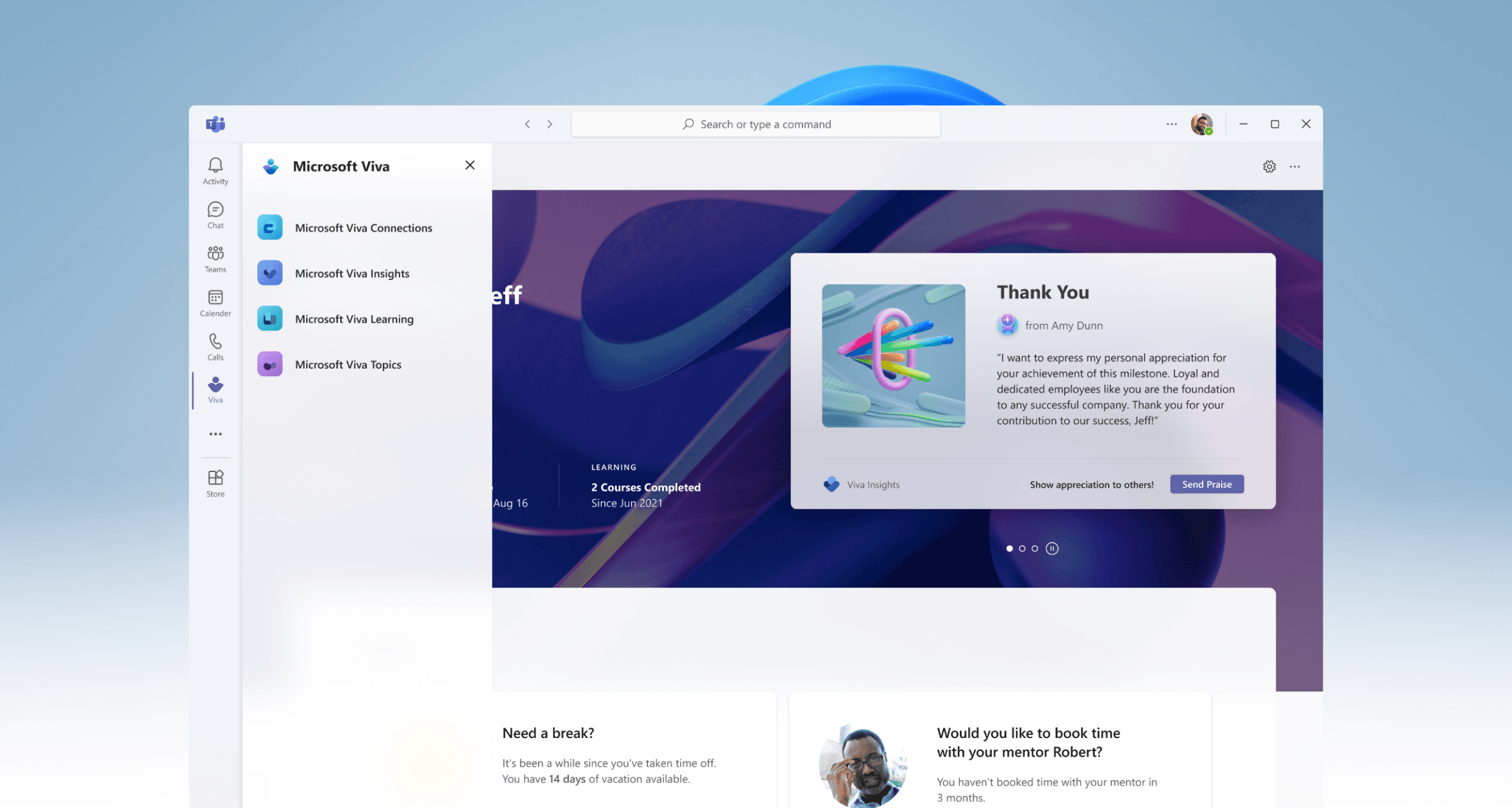
The Viva Connections app was to be a re-envisioned employee experience platform, "Viva Front Door," focused on employee well-being and support of hybrid work outcomes during the pandemic. Partnering with a creative director and the Viva Connections design team, we pushed a North Star vision of “Viva Front Door" (previously named Apollo 13) as this central platform. While primarily collaborating with Viva Connection's design, UX research, and PM teams, we also worked closely with designers across the early Viva Suite—Learning, Topics, Insights, and Connections—to ensure a cohesive experience and gain a better understanding of how this ecosystem could work together. As one of the founding designers for Microsoft Viva, I played a key role in its evolution.
The Viva Connections app was to be a re-envisioned employee experience platform, "Viva Front Door," focused on employee well-being and support of hybrid work outcomes during the pandemic. Partnering with a creative director and the Viva Connections design team, we pushed a North Star vision of “Viva Front Door" (previously named Apollo 13) as this central platform. While primarily collaborating with Viva Connection's design, UX research, and PM teams, we also worked closely with designers across the early Viva Suite—Learning, Topics, Insights, and Connections—to ensure a cohesive experience and gain a better understanding of how this ecosystem could work together. As one of the founding designers for Microsoft Viva, I played a key role in its evolution.
The Viva Connections app was to be a re-envisioned employee experience platform, "Viva Front Door," focused on employee well-being and support of hybrid work outcomes during the pandemic. Partnering with a creative director and the Viva Connections design team, we pushed a North Star vision of “Viva Front Door" (previously named Apollo 13) as this central platform. While primarily collaborating with Viva Connection's design, UX research, and PM teams, we also worked closely with designers across the early Viva Suite—Learning, Topics, Insights, and Connections—to ensure a cohesive experience and gain a better understanding of how this ecosystem could work together. As one of the founding designers for Microsoft Viva, I played a key role in its evolution.
Designs
Out-of-box Viva Connections app
Out-of-box Viva Connections app

Fully personalized Viva Connections app
Fully personalized Viva Connections app

Getting started: initial workshops
Getting started: initial workshops
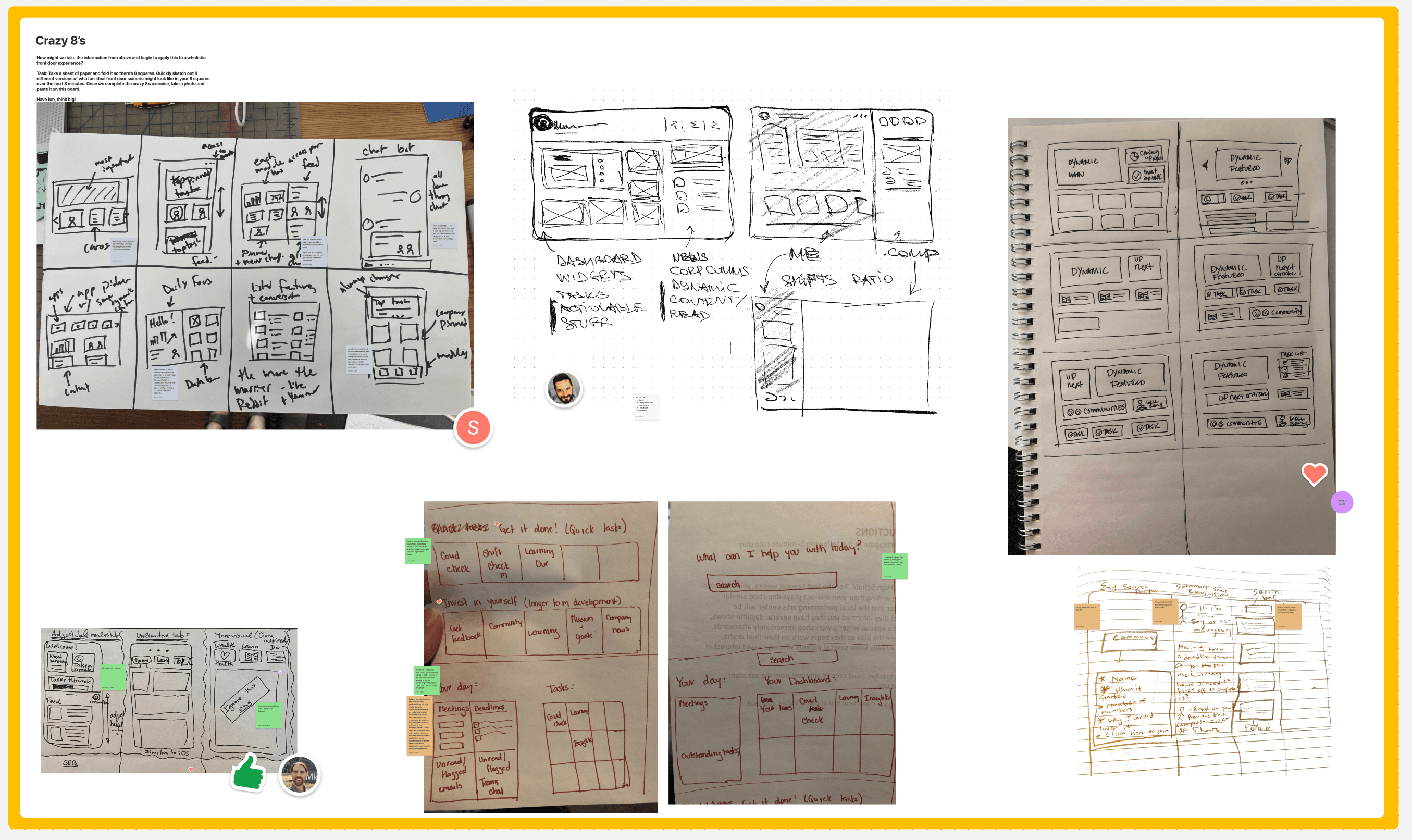
Viva Connections first facilitated a multi-day workshop which was a series of lightning talks by key pms and researchers to help us deep dive us into the framework, latest design work, and their key user roles. Later, collaborating with a new art director, we conducted a multi-day workshop to define key scenarios for our hero user roles: employee and manager. Working closely with PM, we structured the workshop to align with our discovery-phase goals. Our goal was to come to define principles,
user roles and then come up with a series of wireframes that we would present to the senior leadership team and later be evaluated by internal customer groups.
Viva Front Door is:
Viva Front Door is:
A simple, user-friendly, consumer-grade entry point for the employee experience. This front door enhances Viva’s discoverability, streamlines fragmented tools, and fosters employee engagement with the product.
A simple, user-friendly, consumer-grade entry point for the employee experience. This front door enhances Viva’s discoverability, streamlines fragmented tools, and fosters employee engagement with the product.
Workshop goals
Workshop goals
Workshop goals
Define design/ product principles
Define design/ product principles
Define key user scenarios for employees and managers
Gain insights to develop
first round of wireframes
User roles: defined in the workshop

Employee
Employee
We are designing for frontline workers (FLWs) and individual contributors (ICs) who value feeling prepared and connected to their team and work community. They juggle multiple deadlines, manage projects, and navigate various tools. Our design must accommodate users at any stage of their journey—whether it’s their first day or their thousandth.
We are designing for frontline workers (FLWs) and individual contributors (ICs) who value feeling prepared and connected to their team and work community. They juggle multiple deadlines, manage projects, and navigate various tools. Our design must accommodate users at any stage of their journey—whether it’s their first day or their thousandth.

Manager
Manager
We are designing for IW and FLW managers who strive to communicate effectively and create a supportive environment where their teams feel heard and empowered. Our approach considers a diverse range of industries and roles, focusing on
key moments that require feedback to enhance employee well-being and workplace satisfaction.
We are designing for IW and FLW managers who strive to communicate effectively and create a supportive environment where their teams feel heard and empowered. Our approach considers a diverse range of industries and roles, focusing on key moments that require feedback to enhance employee well-being and workplace satisfaction.
We are designing for IW and FLW managers who strive to communicate effectively and create a supportive environment where their teams feel heard and empowered. Our approach considers a diverse range of industries and roles, focusing on key moments that require feedback to enhance employee well-being and workplace satisfaction.

UX Research on low-fidelity wireframe concepts
UX Research on low-fidelity wireframe concepts
After gaining workshop insights from our team, design moved into wireframing concepts that we reviewed with the senior leadership team and eventually brought into UX research with our internal customer groups.
After gaining workshop insights from our team, design moved into wireframing concepts that we reviewed with the senior leadership team and eventually brought into UX research with our internal customer groups.
Direction 01
Mixed View


Feedback
Feedback
The single page delivery of information was appreciated for its synthesis into a single view for those that liked the design.
There was confusion though on how My Team / Team Insights
was shown
The single page delivery of information was appreciated for its synthesis into a single view for those that liked the design.
There was confusion though on how My Team / Team Insights was shown
The single page delivery of information was appreciated for its synthesis into a single view for those that liked the design.
There was confusion though on how My Team / Team Insights was shown
“I like the fact that I don’t have to try to hunt for this stuff. It was a good experience. I like the fact that at a glance you can see everything at once.”
– David, Operations Manager, Transportation
“I like the fact that I don’t have to try to hunt for this stuff. It was a good experience. I like the fact that at a glance you can see everything at once.”
– David, Operations Manager, Transportation
Direction 02
Separate Views


Feedback
Feedback
The split screen of self/team and mix of content worked well though the extent of information shown could be too much for some. It ensures the manager has the experience of being an employee as much as managing a team, particularly so when they are part of a team reporting into someone else as an individual.
The split screen of self/team and mix of content worked well though the extent of information shown could be too much for some. It ensures the manager has the experience of being an employee as much as managing a team, particularly so when they are part of a team reporting into someone else as an individual.
“It allows me to not share the real estate of me and my team stuff. I can switch the hat I am wearing... I do not want to lose sight or track of myself as I am an employee too. Otherwise it’s then more on my manager who has responsibility for me. I want my own team to do the same for me as employees.”
– Becky, Database Manager, Financial Services
“It allows me to not share the real estate of me and my team stuff. I can switch the hat I am wearing... I do not want to lose sight or track of myself as I am an employee too. Otherwise it’s then more on my manager who has responsibility for me. I want my own team to do the same for me as employees.”
– Becky, Database Manager, Financial Services
Direction 03
Editorial / Separate Views
Editorial / Separate Views


Feedback
The cleaner design of this view along with the ability to toggle were the primary areas that worked well here. Showing the data in simpler forms enabled much quicker understanding of what was important or to focus on. Being able to quickly see what tasks/deadlines at the very top as an individual experience also made for a faster way to consume information at the start of the day.
Some form of signposting (as used in design 2) would have enhanced the experience more for some given the ‘News Headlines’ and ‘My Team’ are included at the moment.
The cleaner design of this view along with the ability to toggle were the primary areas that worked well here. Showing the data in simpler forms enabled much quicker understanding of what was important or to focus on. Being able to quickly see what tasks/deadlines at the very top as an individual experience also made for a faster way to consume information at the start of the day.
Some form of signposting (as used in design 2) would have enhanced the experience more for some given the ‘News Headlines’ and ‘My Team’ are included at the moment.
“Leaner and less busy but needs better signposting.”
– Nakul, Corporate Communications Manager, Travel/Hospitality
“Leaner and less busy but needs better signposting.”
– Nakul, Corporate Communications Manager, Travel/Hospitality
For IW's, most participants preferred design #1 because it was focused on them, functional, and compact compared to designs #2 and #3. All IW participants had concerns about who might see the data in the Insights sections and how it might be used, but their concerns were lessened if the design showed an actionable step for them to take based on the insight. Information workers wanted their view to be functional and to help them get their work done efficiently, but were open to emotion and community if
it was in the form of interaction with their colleagues and
not a computer system.
For Managers, no particular design stood out completely above the rest, but participants had fewer issues overall with having their personal content separated from that
of their team (Designs #2 and #3). Managers wanted to see less real estate on Company News (as shown in Design #1) and have more focus on their Personal and Team
information. There was also more interest in keeping a more clean view (as in Design #3) with its usage of graphical based information, but keep more of the signposting
seen in Design #2).
For IW's, most participants preferred design #1 because it was focused on them, functional, and compact compared to designs #2 and #3. All IW participants had concerns about who might see the data in the Insights sections and how it might be used, but their concerns were lessened if the design showed an actionable step for them to take based on the insight. Information workers wanted their view to be functional and to help them get their work done efficiently, but were open to emotion and community if it was in the form of interaction with their colleagues and not a computer system.
For Managers, no particular design stood out completely above the rest, but participants had fewer issues overall with having their personal content separated from that of their team (Designs #2 and #3). Managers wanted to see less real estate on Company News (as shown in Design #1) and have more focus on their Personal and Team information. There was also more interest in keeping a more clean view (as in Design #3) with its usage of graphical based information, but keep more of the signposting seen in Design #2).
For IW's, most participants preferred design #1 because it was focused on them, functional, and compact compared to designs #2 and #3. All IW participants had concerns about who might see the data in the Insights sections and how it might be used, but their concerns were lessened if the design showed an actionable step for them to take based on the insight. Information workers wanted their view to be functional and to help them get their work done efficiently, but were open to emotion and community if it was in the form of interaction with their colleagues and not a computer system.
For Managers, no particular design stood out completely above the rest, but participants had fewer issues overall with having their personal content separated from that of their team (Designs #2 and #3). Managers wanted to see less real estate on Company News (as shown in Design #1) and have more focus on their Personal and Team information. There was also more interest in keeping a more clean view (as in Design #3) with its usage of graphical based information, but keep more of the signposting seen in Design #2).
More collaborative workshops
More collaborative workshops
Viva module party workshop
Viva module party workshop
Driving discovery and usage of Viva modules by including
personalized “best of Viva” experiences in that single destination
Provides meaningful value in the following states:
Driving discovery and usage of Viva modules by including personalized “best of Viva” experiences
in that single destination
Provides meaningful value in the following states:
Driving discovery and usage of Viva modules by including personalized “best of Viva” experiences
in that single destination
Provides meaningful value in the following states:
State
State
Deployment Status
Deployment Status
Employee Status
Employee Status
Blank Slate
Blank Slate
No configuration
No configuration
New (0-6 months+)
New (0-6 months+)
Neo Slate
Neo Slate
Configuration
Configuration
New (0-6 months+)
New (0-6 months+)
Day Zero
Day Zero
No configuration
No configuration
6 months +
6 months +
Steady State
Steady State
Configuration
Configuration
6 months +
6 months +

Co-design Polaris/ Hermes
We led co-creation workshops in Figjam with companies in
our Polaris and Hermes internal customer groups to get
a better sense of what they'd like to see on their custom
dashboard experience.
Top Findings
Participants’ created pages were less information dense than our last round of hi-fi wireframes, indication that consolidation is needed.
Participants’ created pages were less information dense than our last round of hi-fi wireframes, indication that consolidation is needed.
What productivity means to customers
When customers referred to productivity, they meant things
like to-dos, tasks, showing a user’s next upcoming meeting,
or other immediately actionable items.
Most important content types
Tools, productivity, company news, and featured company content were consistently the most important thing to participants between both their content priority outline and building their own boards.
Tools, productivity, company news, and featured company content were consistently the most important thing to participants between both their content priority outline and building their own boards.
Ratio of personal content to company content
The amount of personal versus company related content varied from company to company depending on their culture, but overall most companies’ boards had more personal content than company content.
The amount of personal versus company related content varied from company to company depending on their culture, but overall most companies’ boards had more personal content than company content.

Early Viva brand explorations
Early Viva brand explorations
Vision board: a collection of latest designs in the Microsoft design ecosystem that were the initial grounding point for us to ideate on what Viva would look like.
Vision board: a collection of latest designs in the Microsoft design ecosystem that were the initial grounding point
for us to ideate on what Viva would look like.
Vision board: a collection of latest designs in the Microsoft design ecosystem that were the initial grounding point for us to ideate on what Viva would look like.

Design POVs
Design POVs
Building on research insights from workshops and senior leadership guidance, we developed design POVs focused on key scenarios for our user roles. Below are two examples illustrating the out-of-the-box, customized, and fully customized states of Viva Home. We explored many different approaches: Viva Home as a coach, a hub for HR-related information, a social network, and more.
Building on research insights from workshops and senior leadership guidance, we developed design POVs focused on key scenarios for our user roles. Below are two examples illustrating the out-of-the-box, customized, and fully customized states of Viva Home. We explored many different approaches: Viva Home as a coach, a hub for HR-related information, a social network, and more.
Coach
Coach
“My company is invested in me as a person and wants me to grow ”
“My company is invested in me as a person and wants me to grow ”
Blank state

Steady state Day 0

Steady state

Make it Easy
Make it Easy
“I feel a sense of power and comfort knowing they can find what they need easily ”
“I feel like the company really supports me by giving me the tools to get things done”
“I feel a sense of power and comfort knowing they can find what they need easily ”
“I feel like the company really supports me by giving me the tools to get things done”
Blank MS Viva Coca-Cola

Steady MS Viva Coca-Cola

Viva Navigation and AI
Viva Navigation and AI
In addition, we needed to find ways to integrate a navigation within our AI to quickly access Viva apps within the family and create a cohesive experience within Teams.
In addition, we needed to find ways to integrate
a navigation within our AI to quickly access Viva apps within the family and create a cohesive experience within Teams.